

Blue Sun Room GRAPHICS - IMAGES
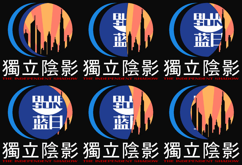
獨立陰影 Logo (Prototype 2)
Friday, May 4, 2007
This is my 2nd prototype of a logo I am developing for one of my 'Firefly' related projects. Thank you to everyone whom gave me advice before. I've made a few ammendments too.
Anyhow once again, I really would like to see what everyone else thinks of it.
CATEGORY: GRAPHICS TIMES READ: 3267 RATING: 9.0 (G) SERIES: FIREFLY
Comments



Friday, 04 May 2007 12:03
The art, the animation,even the angularity of the lettering all create a very eerie effect. I love the way it looks.
But I'm clueless about the meaning. If this is showing that Blue Sun is behind everything (which is why the blue rim around the left side, right?) then why the phrase "the Independent Shadow?" I would think Independent would reference "the Independents" which would imply that Mal's side was somehow behind Blue Sun and what was done to River. Now that is creepy!
Please explain. Something as wonderfully done as this must have a clever meaning and I don't want my pea brain to miss out.
But I'm clueless about the meaning. If this is showing that Blue Sun is behind everything (which is why the blue rim around the left side, right?) then why the phrase "the Independent Shadow?" I would think Independent would reference "the Independents" which would imply that Mal's side was somehow behind Blue Sun and what was done to River. Now that is creepy!
Please explain. Something as wonderfully done as this must have a clever meaning and I don't want my pea brain to miss out.

Friday, 04 May 2007 12:18
I take it the animation has something to do with the destruction of Shadow, Mal's home world? So you have the Alliance (Blue Sun) quite literally swallowing his world. Cute! I'm impressed! I also like the animation. It's simple and it's striking, and that's exactly how a good animation should be in my book.


Friday, 04 May 2007 12:56
Only question I have is this: what's the significance of the silhouette of the skyline? It was my understanding the that core worlds (i.e. the ones who'd have such a skyline) were alliance, not independent...
Friday, 04 May 2007 15:30
Right Causal, when Mal talks to YoSafBrig about his childhood, he makes the planet (at least some of it) sound rural. I was totally buying DesktopHippie and kicking myself until I read your entry.
C'mon Superfluous, what gives?
C'mon Superfluous, what gives?

Saturday, 05 May 2007 01:52
it's a good-looking logo to be sure, but yes, cofusion still reigns.
Saturday, 05 May 2007 07:30
Hi everyone,
Thanks everyone for all the kind words. And as it turns out, I made some controversy in my wait. Sorry about that.
So here I am to explain the symbolism behind this logo…
This is one of my major projects I am working on for Firefly. The project (‘in short’) is an eventual development of a website called ‘The Independent Shadow’. The concept for the site is to have it ‘theoretically’ based on the Independent planet: ‘Shadow’ (in a major city). The site would be a news site, thus using the word ‘Independent’ in the title (although it made sense on two fronts because it was an independent planet) – kinda like the chronicle or advertiser, or times, etc.
Set probably before the war, the site would release ‘fan-fiction news’ on what was happening in the verse at that time. Plus adding synopsis about the show, etc.
So going back to the logo, the use of the ‘Blue Sun’ logo ‘occasionally blinking, was a clever idea I had about the organization in the Firefly verse. I’d imagine that ‘Blue Sun’ would be spanning wide across the verse (even on independent planets). ‘The Independent Shadow’ is therefore auspiced by ‘Blue Sun’. Being on both sides of the war, they were probably big-time war benefactors. So indeed the ‘Blue Sun’ is behind everything, pulling the strings.
Hope that puts justice to everyone’s curiosity.
Thanks everyone for all the kind words. And as it turns out, I made some controversy in my wait. Sorry about that.
So here I am to explain the symbolism behind this logo…
This is one of my major projects I am working on for Firefly. The project (‘in short’) is an eventual development of a website called ‘The Independent Shadow’. The concept for the site is to have it ‘theoretically’ based on the Independent planet: ‘Shadow’ (in a major city). The site would be a news site, thus using the word ‘Independent’ in the title (although it made sense on two fronts because it was an independent planet) – kinda like the chronicle or advertiser, or times, etc.
Set probably before the war, the site would release ‘fan-fiction news’ on what was happening in the verse at that time. Plus adding synopsis about the show, etc.
So going back to the logo, the use of the ‘Blue Sun’ logo ‘occasionally blinking, was a clever idea I had about the organization in the Firefly verse. I’d imagine that ‘Blue Sun’ would be spanning wide across the verse (even on independent planets). ‘The Independent Shadow’ is therefore auspiced by ‘Blue Sun’. Being on both sides of the war, they were probably big-time war benefactors. So indeed the ‘Blue Sun’ is behind everything, pulling the strings.
Hope that puts justice to everyone’s curiosity.

Monday, 07 May 2007 19:16
Definitely some brilliant, brilliant work here, Superfluous!
BEB
BEB
Post Your Comments
You must log in to post comments.