

Blue Sun Room GRAPHICS - IMAGES

獨立陰影 Logo (prototype)
Friday, April 27, 2007
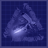
This is a prototype logo I am developing for one of my 'Firefly' related projects. I really would like to see what everyone else thinks of it. I was trying for a new-futuristic-oriental look, and I still havnen't quite figured out the perfect colour scheme for it; so if anyone could give me any kind words of advice, would be most apreciated (or even just to tell me the entire logo is 'yú bèn de').
CATEGORY: GRAPHICS TIMES READ: 3597 RATING: 8.0 (G) SERIES: FIREFLY

Comments
TRINITYTAO
Friday, 27 April 2007 18:01
i like it
looks really cool
i think you are right about the colors though
perhaps not enough contrast (???)
good job though
:D
looks really cool
i think you are right about the colors though
perhaps not enough contrast (???)
good job though
:D

Friday, 27 April 2007 18:05
Make the background a crazy color or pattern? The greyness of it is not freaky enough, I don't think - at least, compared to Fruity Oaty Bars. If that's not what you're going for (although that would work well with the circle on the left), then... ::shrugs::
It's good, though, except for the background. If you changed that, though, you might also have to change the colors of the Chinese characters and the words beneath it, to better match the theme.
It's good, though, except for the background. If you changed that, though, you might also have to change the colors of the Chinese characters and the words beneath it, to better match the theme.

Friday, 27 April 2007 20:34
I think it looks pretty great. Not stupid at all. May I ask what sort of item this logo would go on? It's intruiging.

Friday, 27 April 2007 21:05
Try changing the background to black, the lettering to red or blue, and add a different color boarder; that would definately look more Asian. Also, try changing the "The Independent Shadow" part to gray. Other than that, it looks pretty good!
Friday, 27 April 2007 21:06
Try changing the background to black, the lettering to red or blue, and add a light color boarder; that would definately look more Asian. Also, try changing the "The Independent Shadow" part to gray. Other than that, it looks pretty good!


Saturday, 28 April 2007 00:28
I like the characters and the writing underneath. I like the idea of a shadow of buildings in the circle you have, but the circle itself isn't working for me - it looks too much like a cat's eye. As well, the red rays are too Japanese (old flag). Still, I think it's way cool that you're making FF stuff. Keep the Browncoat love alive!

Saturday, 28 April 2007 13:36
I feel silly trying to give you advice, anyone who's come up w/ this neat idea. I like it alot. As for the color scheme, try resetting the background to white, and then try some other variations. The cirle kinda bothers me too. Might be I'm trying too hard to find things wrong, but it just looks a bit busy. Maybe just go w/ the basic circle, and leave the hightlights off. As for the Japanese looking 'sunrise' inside the circle...maybe try concentric circles expanding outward ? Hope that makes sense.

Monday, 30 April 2007 00:33
Amazing work here, Superfluous! Definitely all kinds of impressed;D
Really can't suggest any new idea for alterations, except maybe make the grey box brow or red and the lettering a complimentary lighter colour...
BEB
Really can't suggest any new idea for alterations, except maybe make the grey box brow or red and the lettering a complimentary lighter colour...
BEB
Monday, 18 June 2007 05:43
well, for what it's worth, i think that there are too many colours. i'd avoid blue(simply because of the blue sun connection) and i would stick with, for example, red, black and white ie: red bg, white characters and black 'independent'... and do the circle with the same colours in a similar proportion.
but that's just my fitty-cents :o)
but that's just my fitty-cents :o)
Post Your Comments
You must log in to post comments.