

Blue Sun Room GRAPHICS - IMAGES
Serenity Poster
Thursday, March 2, 2006
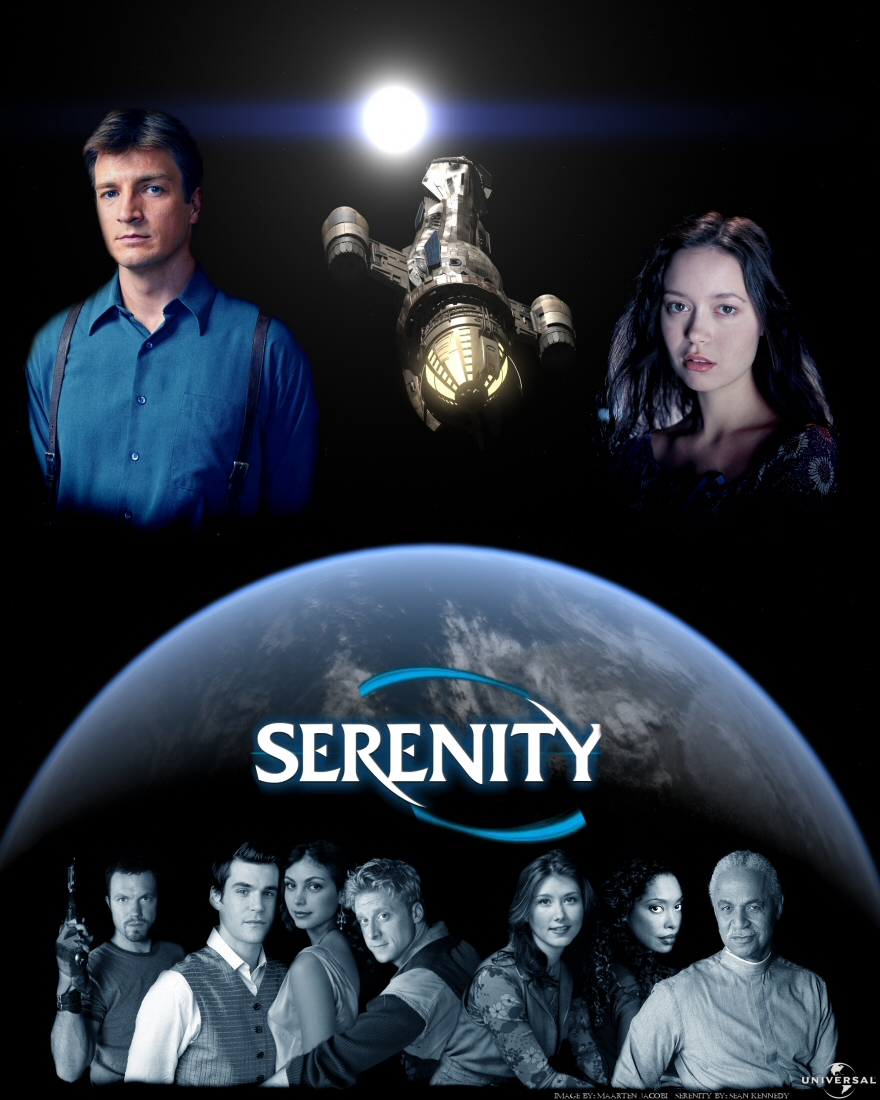
Hi all! I decided to create a Serenity poster using Lightwave and photoshop (well, mostly photoshop).
I'm not very experienced with photoshop, but I think this one turned out pretty well.
CATEGORY: GRAPHICS TIMES READ: 3564 RATING: 9.0 (G) SERIES: FIREFLY
Comments


Thursday, 02 March 2006 23:52
I like it, but a: a little bitof the Y is cut off and B: what is wash doing to simon?


Friday, 03 March 2006 01:19
Other than the flaws obviously pointed out by CaptianS, it's great, but all the people (especially River) are kind of pixelated, was it something the site did (it used to do it to mine too) or could you just not find the right sizes? (and when you're doing a black background, make sure the background behind the characters in the original pictures is black too)
Please, please don't think I'm being too critical, it's a beautiful picture, even with the flaws!
Please, please don't think I'm being too critical, it's a beautiful picture, even with the flaws!
Friday, 03 March 2006 01:32
bluefishie, i am impressed you noticed (thought i was the only one). However i believe river wasn't behind a black background which makes it exstra hard because of the long hair... so it was a pretty good job. keep at it orcblaster
Friday, 03 March 2006 01:43
Thanks for the comments guys! :-)
As for the Y being cut off: Yeah, I could find a decent-sized Serenity logo (in this style) and had to settle for this...
And about Wash and Simon...I really didn't see that...no really, you have to believe me! :-)
And uhm, the River picture was a little hard to place in there...but I just thought it was such a good picture of her I HAD to use it, and I didn't want to cut too much of her hair :-)
Again: thanks for the comments! :-)
As for the Y being cut off: Yeah, I could find a decent-sized Serenity logo (in this style) and had to settle for this...
And about Wash and Simon...I really didn't see that...no really, you have to believe me! :-)
And uhm, the River picture was a little hard to place in there...but I just thought it was such a good picture of her I HAD to use it, and I didn't want to cut too much of her hair :-)
Again: thanks for the comments! :-)
Friday, 03 March 2006 01:49
And uhm, about the picture being somewhat pixelated: that's weird; I have a very large resolution version of this picture and decided to resize it for this site...it should be pretty good quality...
Friday, 03 March 2006 02:41
send me the picture of river and i'll cut it out for you with out loseing alot of the hair (i know how it is, it's terible when you have an awesome picture and have to remove tons of hair.)
Friday, 03 March 2006 03:29
The site sometimes does do that, and I could find a picture of river with a black background if you want. (If you're going through screen caps, then I'd look for one on an episode like Bushwhacked or something)
Friday, 03 March 2006 03:30
And there are tools on photoshop that can darken the area around something, and because River's hair is almost black, it won't do much damage.

Friday, 03 March 2006 06:31
River looks, quite positively, quite fine to me. :) She's always stunning to watch! Especially in this high-res picture. Very nice River job! Oh, wait a tick, there's some other folks in this as well, lol. Well, they're ok too, I guess. :)
Love the planetary view, too. And all the blue, in planet, and Mal's shirt, and logo, really nicely put together. :)
As for the Y, can you not just mirror a part of the other 'leg' of the Y, and paste it in?
Then there's River. Did I mention River? In case I didn't, she's fantastic! :)
Love the planetary view, too. And all the blue, in planet, and Mal's shirt, and logo, really nicely put together. :)
As for the Y, can you not just mirror a part of the other 'leg' of the Y, and paste it in?
Then there's River. Did I mention River? In case I didn't, she's fantastic! :)
Friday, 03 March 2006 10:24
binkewl: Thanks! You can find the high-res River picture I used here: 
And bluefishy: I think I'll keep this River picture, 'cause screencaps aren't that high-res; and I need a high-res version :-)
And to asarian: THanks! And I think I'll try to mirror the Y thingy :-) thanks a lot for the tip!
And bluefishy: I think I'll keep this River picture, 'cause screencaps aren't that high-res; and I need a high-res version :-)
And to asarian: THanks! And I think I'll try to mirror the Y thingy :-) thanks a lot for the tip!
Friday, 03 March 2006 14:16
hmm, page wouldn't load for me, go head and send it 2 me at gimli_is_da_bomb@hotmail.com
if u get the pic to me by today i'll get it back to you today
if u get the pic to me by today i'll get it back to you today

Friday, 03 March 2006 17:31
Fan-frickin-tasic my friend!! Lovin' it! I really like the composition and layout. Perhaps throw a smattering of stars in there if ya can. I'm diggin' the Inara sandwich, but I'm wonderin' about Wash's arm. All in all, this is really well done!

Friday, 10 March 2006 09:30
Like this one a whole lot, good choice of overall colour btw....
Wish I could do as good :)
Wish I could do as good :)
Post Your Comments
You must log in to post comments.