

Blue Sun Room GRAPHICS - IMAGES

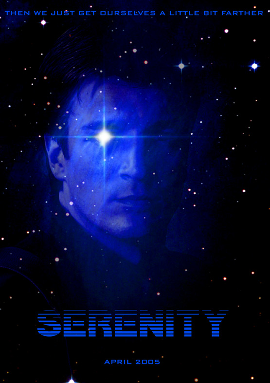
My Poster 2... a bit more to it
Tuesday, September 7, 2004
Added a bit more... tell me what you think... I personally like both, but I think the first is a bit more effective... opinions? And if you want I have a high-res version
CATEGORY: GRAPHICS TIMES READ: 3158 RATING: 8.0 (G) SERIES: FIREFLY
Comments

Tuesday, 07 September 2004 04:50
Ehh..I like the first one better too...this one gives me a Caleb vibe for some reason

Tuesday, 07 September 2004 05:12
The flare on the eye is giving me a very "Borg" feel...


Tuesday, 07 September 2004 12:34
Maybe I am in the minority, but I think this one is so much cooler.
Hey, Inara, do you see that twinkle in Mal's eye? Better lock the shuttle door! LOL
Hey, Inara, do you see that twinkle in Mal's eye? Better lock the shuttle door! LOL

Tuesday, 07 September 2004 13:20
I'LL BE BACK.
looks quite like a promo for the next terminator. cool though.
looks quite like a promo for the next terminator. cool though.
Tuesday, 07 September 2004 17:47
Yeah i was going to say terminator also. I'll be Baak,
Prefer the first one.
Simple yet effective.
Prefer the first one.
Simple yet effective.
Wednesday, 08 September 2004 15:13
Y'know what would make this even better?
An image of River, but with the tag line of "they never stop coming..."
Then the blue sun would be even more poignant.
An image of River, but with the tag line of "they never stop coming..."
Then the blue sun would be even more poignant.
Post Your Comments
You must log in to post comments.