

Blue Sun Room GRAPHICS - IMAGES
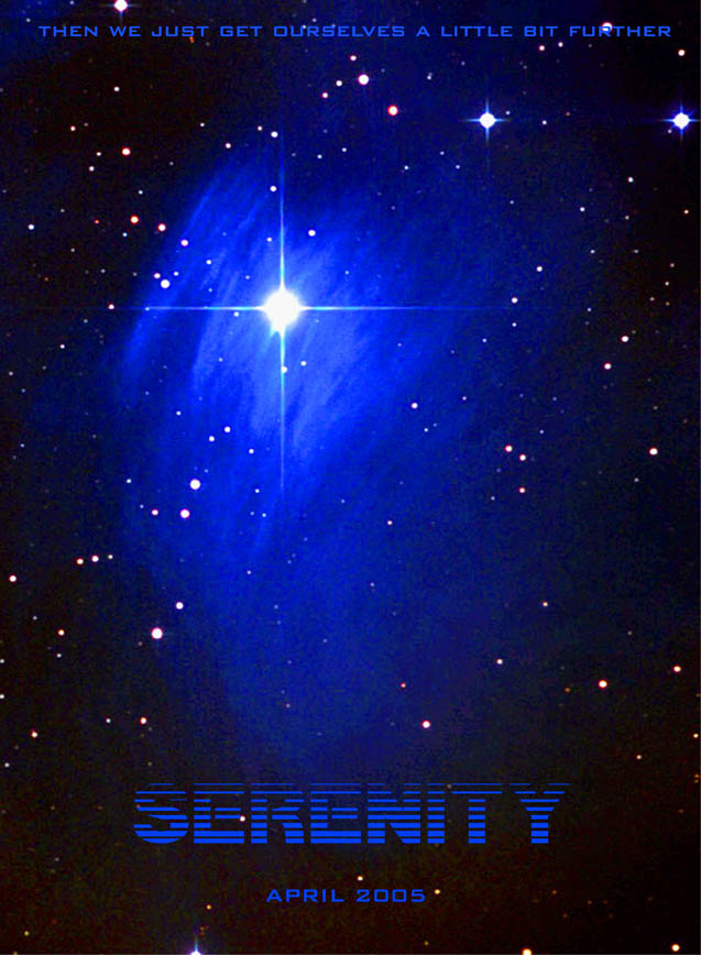
My Serenity Poster
Monday, September 6, 2004
I went for somplicity... Wanted it to seem like an 80s sci-fi movie poster... kinda like 2001 nand stuff... so it's real simple.
CATEGORY: GRAPHICS TIMES READ: 3432 RATING: 8.0 (G) SERIES: FIREFLY
Comments

Monday, 06 September 2004 06:50
And yes, before anyone says... this really did take no effort on my part... Googled "nebula" slapped some text on it, did a little color balancing... voila

Monday, 06 September 2004 07:43
That's pretty cool. I like the 'less is more' thing you got going on there.



Monday, 06 September 2004 18:38
Very serene. Creative art is knowing when to leave stuff out as well as putting stuff in. (A problem I still fight with)

Monday, 06 September 2004 20:43
I like it. It does have a very 80s feel. Not 2001, (which came out in 1968), but like a few of the SF flicks from the 80s. Very cool.

Wednesday, 08 September 2004 20:01
Definitely like this one better than the 2nd one. Less is certainly more in this instance.
Post Your Comments
You must log in to post comments.