

First Images from New Star Trek!
POSTED BY: CrevanReaver
UPDATED: Sunday, February 15, 2026 14:37
VIEWED: 27802
PAGE 5 of 11
Quote:
Originally posted by BrownCoat1:
Pics look good so far, though I have to agree the bridge set is way overdone. That looks a heck of lot fancier than any set from previous movies. If this is a prequel shouldn't the set have been simplier, say along the lines of Enterprise the tv series or something?
Well, I think that's where Enterprise failed, actually (that, and a story-line they could never decide on where it would go). People love fancy. Conceptually, yes, I agree, it should probably be more like Enterprise, the TV series, but folks just don't accept metal, sixties-like communicators and such any more.
--
"Mei-mei, everything I have is right here." -- Simon Tam
NOTIFY: Y | REPLY | REPLY WITH QUOTE | PERMALINK | TOP | HOME

Quote:
Originally posted by JaynesMane:
Interesting.
I can't help but feel a bit betrayed by the way the actors look almost nothing like the original character they are portraying though.
---
http://surveysafari.x10hosting.com/redirect.html - Make money online filling out surveys!
I have to disagree with you there. To a point.
It's spooky how much Karl Urban looks like Bones, and Quintano looks a lot like a young Leonard Nimoy. I would have never considered Urban for McCoy, but he is such a versatile character actor, that he'll probably pull it off well. He certainly has the look and posture of Bones in the pics!
Yeah, "Harold" doesn't looks much like Sulu, and the "Shawn of the Dead" guy doesn't look anything like Scotty, but the actors playing Kirk and Uhura do have some similar features.
Getting a actor like Shatner for Kirk is a once in a lifetime thing. J.J. had to find a new way to portray Kirk, and a new actor to interpret the role. Anything else, and it would have felt like a parody of Shatner. The key to making that work, is to find the perfect Bones and Spock to complement him. I think Pines will work as Kirk, because the director bookeneds Chris Pines with actors like Quintano and Urban.
I'd given some thought to movin' off the edge -- not an ideal location -- thinkin' a place in the middle.
NOTIFY: Y | REPLY | REPLY WITH QUOTE | PERMALINK | TOP | HOME

Behold, the U.S.S. Enterprise:
NOTIFY: N | REPLY | REPLY WITH QUOTE | PERMALINK | TOP | HOME
This image bothers me.
The proportions seem off, and the nacelle arms are mounted awkwardly too far to the rear of the secondary hull. Why is the secondary hull moved so far forward? Just to be different? It doesn't have the balance of the original, or the sleek lines of the movie era version. Yeah, it's different, but it isn't better at all!
I have to say I prefer Gabe's version better. It's got the right balance and proportions, but looks modern. 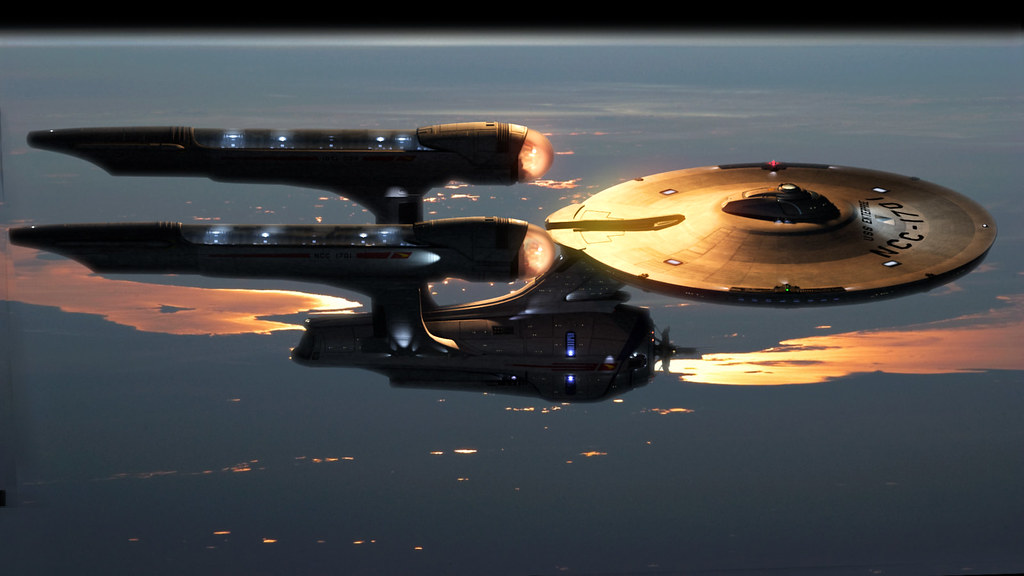
Funny how a fanboy like us, designed a far better modernized version of the Enterprise, than the version Hollywoods best artists came up with. Someone paid good money for this mess? They should have saved a ton of wasted time and money, and paid for Gabe's design. He got it right!
I'd given some thought to movin' off the edge -- not an ideal location -- thinkin' a place in the middle.
NOTIFY: Y | REPLY | REPLY WITH QUOTE | PERMALINK | TOP | HOME

Quote:
Originally posted by MacBaker:
This image bothers me.
The proportions seem off, and the nacelle arms are mounted awkwardly too far to the rear of the secondary hull. Why is the secondary hull moved so far forward? Just to be different? It doesn't have the balance of the original, or the sleek lines of the movie era version. Yeah, it's different, but it isn't better at all!
Got to agree. Different, but definitely not better.
Is it just me, or do the nacelles remind anyone else of fins or something off of 50s car?
Quote:
Originally posted by MacBaker:
I have to say I prefer Gabe's version better. It's got the right balance and proportions, but looks modern.
Funny how a fanboy like us, designed a far better modernized version of the Enterprise, than the version Hollywoods best artists came up with. Someone paid good money for this mess? They should have saved a ton of wasted time and money, and paid for Gabe's design. He got it right!
I have to agree again. I like this version much better than the one aboce. This one seems much more the way I'd imagine the Enterprise.
__________________________________________
Holding the line since December '02!

Richmond, VA & surrounding area Firefly Fans:
http://www.richmondbrowncoats.org
Color Officer / X.O. Echo Company
http://76thbattalion.homestead.com/index.html
NOTIFY: Y | REPLY | REPLY WITH QUOTE | PERMALINK | TOP | HOME

Now now; young minds, fresh ideas- we must be tolerant.
Inapigseyeisall
NOTIFY: Y | REPLY | REPLY WITH QUOTE | PERMALINK | TOP | HOME
Quote:
Originally posted by chrisisall:
Now now; young minds, fresh ideas- we must be tolerant.
I think I'm very tolerant!

I'm okay with a "young" "fresh" new cast playing my favorite Trek characters, but I still have issues with this "new" Enterprise. The engines look like they were taken off some 50's era caddy, the secondary hull is wayyyy too far forward, and the overall shape just seems awkward! Maybe it will look better from other angles, but from what I've seen, I still think the best version of the Enterprise was first seen in Star Trek: The Motion Picture. That one brought tears to my eyes! This one just makes me want to cry!

I'd given some thought to movin' off the edge -- not an ideal location -- thinkin' a place in the middle.
NOTIFY: Y | REPLY | REPLY WITH QUOTE | PERMALINK | TOP | HOME
Quote:I'm with ya 100% here, Mac.
Originally posted by MacBaker:
I still think the best version of the Enterprise was first seen in Star Trek: The Motion Picture. That one brought tears to my eyes!
And all those flowing, aerodynamic lines they got goin' there in the new one remind me of the kinda lines you'd see on concept race cars...
@ JJ: no need for aerodynamic lines on a ship that only travels in space, yo.
Balance of design would be good, though.
 Chrisisall
NOTIFY: Y | REPLY | REPLY WITH QUOTE | PERMALINK | TOP | HOME
Could be a Remon...who knows. You know, from Nemisis. Looks kinda like one. I'm not totally up in the whole story line, but it could be.
__________________________________________________________________________________________________________
CREATOR OF THE MOST RANDOM ACCIDENTAL THREAD IN THE 'VERSE, AND PREVIOUS OWNER OF A BILLBOARD SIZED SENTIENT KILLER BANNER!


NOTIFY: Y | REPLY | REPLY WITH QUOTE | PERMALINK | TOP | HOME

I like the new design. Still clearly the enterprise, but it feels sturdier, more real to me.
I know fans have been going on about that fan-designed one for a while, but the nacells look like giant vibrators to me.
"I thoroughly disapprove of duels. If a man should challenge me, I would take him kindly and forgivingly by the hand and lead him to a quiet place and kill him."
NOTIFY: Y | REPLY | REPLY WITH QUOTE | PERMALINK | TOP | HOME