

Blue Sun Room GRAPHICS - IMAGES
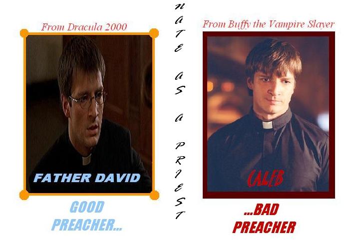
Nate as a priest x2
Monday, November 22, 2004
Caleb wasn't the only 'man of the cloth' that Nathan played...
CATEGORY: GRAPHICS TIMES READ: 3336 RATING: 7.0 (G) SERIES: FIREFLY
Comments

Monday, 22 November 2004 11:12
Nice work Manti....much better then the previous version.
Some tips for the next time:
1 - Stick to 1 or 2 font types and just vary with size and color. I personaly would've made the title in the centre a bit bigger, cause it falls a bit to the back.
2 - Try to get a better program for this kinda work....Paint isn't very well equiped for this.
Just keep on doing these kind of thing....preferably in another program.
You got good ideas, and I think with another program you've got even more tools to get them out here!!!
Well you wanted some honest comments...so you got them
Some tips for the next time:
1 - Stick to 1 or 2 font types and just vary with size and color. I personaly would've made the title in the centre a bit bigger, cause it falls a bit to the back.
2 - Try to get a better program for this kinda work....Paint isn't very well equiped for this.
Just keep on doing these kind of thing....preferably in another program.
You got good ideas, and I think with another program you've got even more tools to get them out here!!!
Well you wanted some honest comments...so you got them

Monday, 22 November 2004 14:41
It's been a long time since my last confession - but looking at these, I think I can remember where everything goes!
Post Your Comments
You must log in to post comments.