

Blue Sun Room GRAPHICS - IMAGES
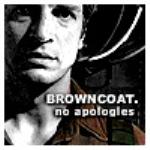
Brush and Ink Mal
Thursday, April 19, 2007
and some pen work in here also
CATEGORY: GRAPHICS TIMES READ: 3412 RATING: 9.0 (G) SERIES: FIREFLY

Comments

Thursday, 19 April 2007 08:09
Although I am a massive fan of your sepia pictures (and Mal in particular - if you hadn't already guessed) this is shiny!

Thursday, 19 April 2007 15:11
Heyya Mike -
I find these two pictures so interesting to compare. I love the effects of the black and white, the way it's shaded partly in lines and partly little dots. But I miss seeing the half of his face on the right. The high contrast makes him look more pouty somehow, changes the expression around his mouth.
But, hey, both portraits are gorgeous and get 10s from me! It's wonderful to have you posting Mal art again! :)
I find these two pictures so interesting to compare. I love the effects of the black and white, the way it's shaded partly in lines and partly little dots. But I miss seeing the half of his face on the right. The high contrast makes him look more pouty somehow, changes the expression around his mouth.
But, hey, both portraits are gorgeous and get 10s from me! It's wonderful to have you posting Mal art again! :)

Thursday, 19 April 2007 23:22
Love the ink work. It would be a perfect black and grey tat piece.


Saturday, 21 April 2007 07:03
While as usual I prefer the sepia, this is quite the shiny addition. The way it catches the expression in his eye is very appealing.

Saturday, 21 April 2007 22:59
Damn...now this is just some cool beans, Mike. A different vibe from the different medium (ink vs. graphite) and higher contrast, but still great work:D
BEB
BEB

Sunday, 26 August 2007 05:40
I rather like this style. You should do a character series in this style. After you've completed whatever other requests, of course.
Post Your Comments
You must log in to post comments.