

Blue Sun Room GRAPHICS - IMAGES

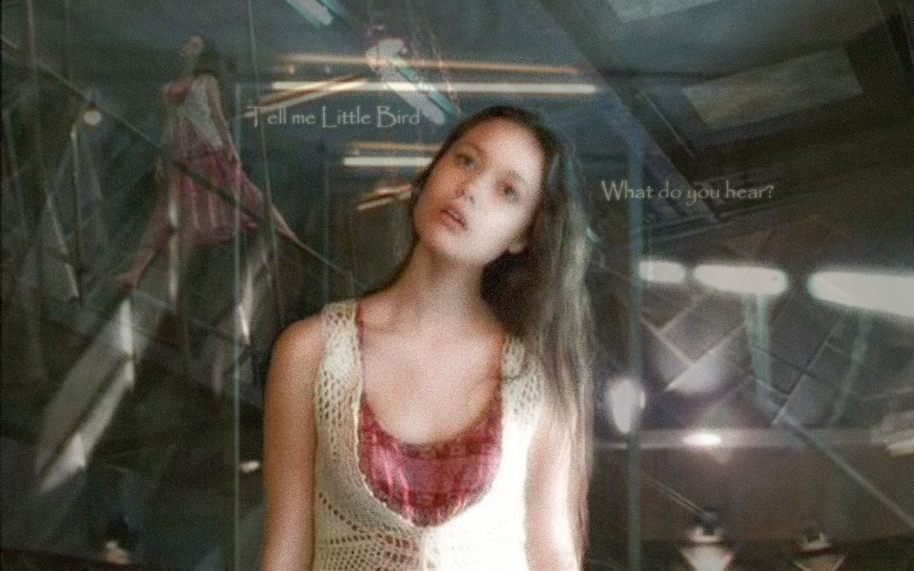
Little Bird, Version II
Wednesday, January 24, 2007
Ok so I fiddled around more with this particular project and I feel that this end result is better. Anyway, constructive criticism is always welcome.
CATEGORY: GRAPHICS TIMES READ: 1367 RATING: 9.0 (G) SERIES: FIREFLY
Comments

Wednesday, 24 January 2007 22:01
Oh...this is just spectacular stuff, Nidrian! Very etheral and suited towards this moment in time and River's personality:D
BEB
BEB

Thursday, 25 January 2007 00:21
Oddly enough, I like the original you did better. "Too much light." :) And I prefer the other filter over the grain on her body.
I see you improved the visibility of her face; good thinking. :) Faces, important.
Also, I like the spacing of the text on the other one better, too. There's a spatial aspect about having to read the first line, in the top left corner, all the way down to the bottom-right corner, to the second line. I reckon it really works because the pulled apart text-parts kinda enlarge one's spatial perception of the whole scene; as if the brain is forced to experience the fullness of the room. Conversely, having the two lines closely around River, in this one, makes my brain kinda think her hearing scope is limited to that (virtual) radius.
Oh, be sure not to take me too seriously, lol. I'm just more-or-less thinking out-loud as to why I like the first one better. Don't really mean I know what I'm talking about. :)
9/10, for certain.
I see you improved the visibility of her face; good thinking. :) Faces, important.
Also, I like the spacing of the text on the other one better, too. There's a spatial aspect about having to read the first line, in the top left corner, all the way down to the bottom-right corner, to the second line. I reckon it really works because the pulled apart text-parts kinda enlarge one's spatial perception of the whole scene; as if the brain is forced to experience the fullness of the room. Conversely, having the two lines closely around River, in this one, makes my brain kinda think her hearing scope is limited to that (virtual) radius.
Oh, be sure not to take me too seriously, lol. I'm just more-or-less thinking out-loud as to why I like the first one better. Don't really mean I know what I'm talking about. :)
9/10, for certain.


NIDRIAN
Thursday, 25 January 2007 03:23
asarian; the visibility of the face is why I liked this one better. That being said, thanks for your shiny comment, I like knowing why something is good or bad.
Saturday, 27 January 2007 22:48
This is very pretty work! Though, if I had the skill to do it, I might dial down the grain slightly so that River is a little smoother, but still "other-worldly".
Post Your Comments
You must log in to post comments.