

Blue Sun Room GRAPHICS - IMAGES
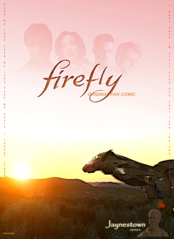
Firefly Comic (Screencaps): Jaynestown Cover
Friday, September 1, 2006
The refabbed comic cover with more in the corner to indicate the series. Nothin' much.
CATEGORY: GRAPHICS TIMES READ: 2565 RATING: 9.0 (G) SERIES: FIREFLY
Comments


Friday, 01 September 2006 04:22
Lookin' shiny! My only suggestion is to maybe make the characters a bit more opaque. Also instead of having theme lyrics down the side of the cover, you could put them on their own page after the "teaser", where the opening theme plays in the show.

Friday, 01 September 2006 05:10
I like the little addition of the statue. It adds a nice visual introduction of the episode as well as the title.

Monday, 04 September 2006 03:58
Pretty dang shiny, Yorik...though I too think the Ballad lyrics could be better positioned elsewhere;)
BEB
BEB
Post Your Comments
You must log in to post comments.