

CSTS 2023 Art Contest Voting ends March 20, 2023
POSTED BY: ANONYMOUS1
UPDATED: Thursday, March 16, 2023 17:26
VIEWED: 1744
PAGE 1 of 1

https://www.cantstoptheserenity.com/media/csts-2023-artwork-contest/
NOTIFY: Y | REPLY | REPLY WITH QUOTE | PERMALINK | TOP | HOME
https://www.cantstoptheserenity.com/media/csts-2023-artwork-contest/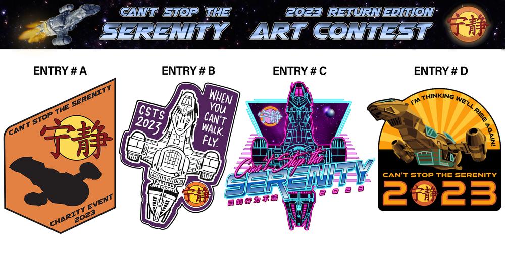
NOTIFY: Y | REPLY | REPLY WITH QUOTE | PERMALINK | TOP | HOME

'Art' is subjective...BUT... for me
D it just jumps out
They are all great in their own way but if I were to criticize
first one feels off and breaks something like 'Rule of Thirds' also on the link in T-Shirts you don't mix Fire Orange and Light Blue in a Top they are discording colors, if you don't know anything about colors ask women not what is right in fashion but ask them what colors are 'wrong' also show us the ship don't just show a Shadow or silhouette, or a reverse projection, give a little more visual detail of the ship.
the second is too plain or mono-tone, the poster with stars look nice but it could have done with more effort
C is Cyberpunk AI or Newwave 80s cyborg aesthetic and that is not the Firefly universe its a Western in space it is not Terminator, it is not Nemesis, it is not TRON Legacy, not Robocop, not Burst City not Akira not Metropolis, not the Matrix...in fact a lot of tech in Firefly seems to regressed almost Steampunk Mad Max style...for example the Lassiter One of only two remaining original handheld Laser Pistols from Earth-that-was known to exist... still a cool design but the right poster for the wrong movie.
Black and Yellow should not work they are like Wasp warning signs but for some reason it does, maybe its the layout or writing or rising sun or adding of blue and subtle reds and orange
NOTIFY: N | REPLY | REPLY WITH QUOTE | PERMALINK | TOP | HOME