

C'est la Photo
POSTED BY: PhoenixRose
UPDATED: Wednesday, July 7, 2010 22:31
VIEWED: 37941
PAGE 2 of 13

Why yes...yes you did Auraptor:)
HUGS Rose... hubba hubba!!
HK...I love that mug!! Where ever did you get it???
Briglad....brrrrrrrrrrrrr
OK baby time
Aren't they just cute at their meeting of the mutual adoration society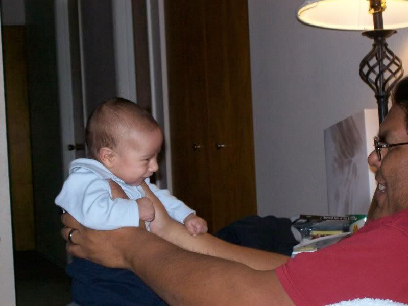
Tummy time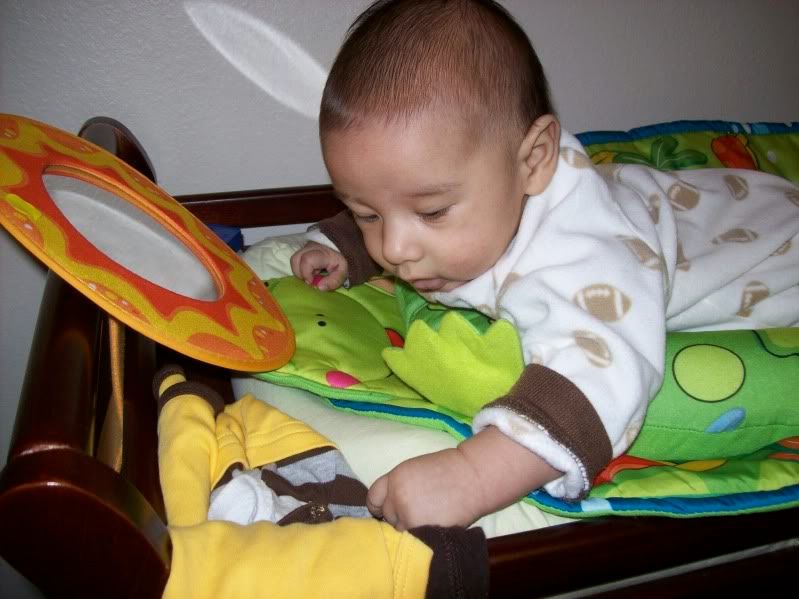
Chewin the froggy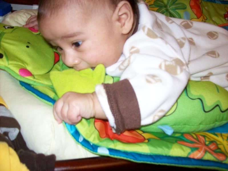
 To love someone is to see a miracle invisible to others.
--Francois Mauriac
It's fuzzy-minded liberal thinking like that that gets you eaten.
NOTIFY: N | REPLY | REPLY WITH QUOTE | PERMALINK | TOP | HOME

Quote:
Originally posted by MsA:
HK...I love that mug!! Where ever did you get it???
Quote:^ ^^^ ^^^^^ ^^^^^^^ ^^^^^^^^^^^ ^^^^^^^^^^^^^
Originally posted by Hell's Kitten:
(Tea, Earl Gray, Hot - foto)
( http://www.cafepress.com/sk/wilwheaton)

http://www.flickr.com/photos/sara013
NOTIFY: Y | REPLY | REPLY WITH QUOTE | PERMALINK | TOP | HOME
Hallo...
((edited to save space - photos removed))
Sorry for taking up so much room here... And thank you for your time.
NOTIFY: Y | REPLY | REPLY WITH QUOTE | PERMALINK | TOP | HOME

S2cc: Nice array of objects, has depth.
s2aa: Clear, fills the space without a cluttered feel. O13 is prominent without being the main focus.
b6cc:Like the angles, like the floral object, reminds me of objects spilling out of a drawer.
b6aa: Like the composition, draws the eye in, 013 still prominent.
b4aa: Would be good for a smaller space (resolution).
I actually like them all, but those are my favorites. While I do like the stamped 013, I think it gets lost and the cutout shows off your skills a little more. I like the offset 013s better than the front-and-center ones because it draws your eye across the space and makes you look at the other objects.
(Haha objects in space.. ha. I'll go dork out somewhere else now.)
As for pricing.. well, recoup the cost of materials, the amount of time you put in at a relatively reasonable hourly rate, and double it for markup/profit margin?
(This is why art is expensive... it takes a lot of time by a skilled person. Just about anybody can operate a button on a plastic model assembly line.)
NOTIFY: Y | REPLY | REPLY WITH QUOTE | PERMALINK | TOP | HOME
Thank you for your analysis, Rosie!
((eHeart!))
Quote:Ah-HA! ((pounce!))
Originally posted by stinkingrose:
As for pricing.. well, recoup the cost of materials, the amount of time you put in at a relatively reasonable hourly rate,
See, I have no perspective on "reasonable hourly rate".
What do hoomans consider "reasonable"?? O.O
PS> http://www.etsy.com/shop/sara013 is me
NOTIFY: Y | REPLY | REPLY WITH QUOTE | PERMALINK | TOP | HOME
The more talented you are and the harder it is to do, the more you can and should charge.
I personally *want* eleventy billion dollars an hour for my work. I do not, however, haz teh mad skillz. I would not accept minimum wage rates, because it's a lot harder than things I've done that I was willing to accept minimum wage to do, (even the coffee shop paid a little better than that).
You could snoop around and see what other artists who are doing a similar level of complexity in their work are charging and try to figure out how much of what they charge was for materials, and how much was for them.
Or you could ask artists, jewelers, and other people doing things which are not completely unsimilar to your work "so, how do you figure out what to charge for a piece?", they will probably be willing to talk.
The trick is to not charge so much that nobody wants to buy the stuff.
Your things are works of art. They are one-of a kind items which probably cannot be reproduced, or at least not in large quantities. We will not find them at Claire's Boutique next to the plastic tiaras. We will not even find them at a chain fine jewelry store. If you were able to just put some metal into a jig and bend it around and "poof" a little while later you had another one just like the first one, you'd probably be able to charge less for them. It's like a drawing vs. a print. I can get a print of someone's work, but to purchase the work I'd have to pay a lot more.
Jump in if I'm completely off base here, folks...
I'm seeing a friend today who makes dolls. Glorious angels (more like elemental spirits really) that take your breath away or make you want to cry or take them home, not nursery playthings. I'll try to remember to ask her about it.
(I'll be busy discussing eco-politics and organic lettuce-raising/gopher repelling strategies, and eating lots of nommy foods. It's the annual potluck seed order for our NOFA chapter. The root vegetables tend to absorb my attention, and discussion of tomato pollination for improved germination rates is absorbing stuff if you're of the right mindset.)
It's like this:
(Rolls a can of Dew across the floor. Points.)
"What's that?!"
See? You forget everything else for at least a fraction of a second and other things can creep in where something was.
NOTIFY: Y | REPLY | REPLY WITH QUOTE | PERMALINK | TOP | HOME

Some pretty stuffs on display there HK, as for my thoughts on the banners...
I like the very first one, s2dd. More so than the one below it though I can't quite put my finger on why. They're almost the same image.
s2bb I do not like. It's still pretty stuffs and all, but having the 013 over on the right hand side does not work for me. Not at all. I think it looks better over on the left, and definitely no further right than center.
b6cc is probably my very favourite of the bunch though. I'd choose that. b6aa comes a close second. I could have just said that up front, but I thought you might want a lil more feedback on others too.
As for price... I have no idea. If you enjoy making the items and aren't too bothered to see them leave your possession when you're finished, maybe you could start pricing fairly low, enough to make back cost of materials and gain a lil profit, then creep them up a bit and see how people react? When folks are saying "OMFG!!11! No wai!" then you went too far.
NOTIFY: N | REPLY | REPLY WITH QUOTE | PERMALINK | TOP | HOME

s2aa is probably my favorite layout, I like the off-center 013 and the other elements. b6cc is another favorite; it has a lot of variation of color in the objects and the layout has rhythm. I also like b6aa a lot, though I'm not sure the 013 is quite visible enough; it's almost going off the page. To me, that creates some visual interest, but that kind of thing can be very hit-or-miss with different people.
I don't know what the going rate is for metal-worker artisans, but I would say your skillz are worth not much less than $20 an hour, possibly a good deal more. [/sig]
NOTIFY: N | REPLY | REPLY WITH QUOTE | PERMALINK | TOP | HOME
Quote:I think it's cuz that damn silver thing at the right in 2cc doesn't match the colouring of anything else in that banner.
Originally posted by Navyseils:
I like the very first one, s2dd. More so than the one below it though I can't quite put my finger on why.
It drove me crazy, so I had to remove it for 2dd. XD
Thank you guys very much for your input.
I *really* do appreciate it.
I've always struggled with this, as being an enginerd has skewed my perspective about 15 degrees from reality. Heh.
So, based on what I'm reading here...
...if I charge less than eleventy billion dollars an hour,
I should be okay.
Excellent! XD
NOTIFY: Y | REPLY | REPLY WITH QUOTE | PERMALINK | TOP | HOME
Quote:((pounce!!!)) You do not roll the Dew!!!
Originally posted by stinkingrose:
It's like this:
(Rolls a can of Dew across the floor. Points.)
"What's that?!"
See? You forget everything else for at least a fraction of a second and other things can creep in where something was.
O.O!!!
Wait... what?
NOTIFY: N | REPLY | REPLY WITH QUOTE | PERMALINK | TOP | HOME