

Blue Sun Room GRAPHICS - IMAGE

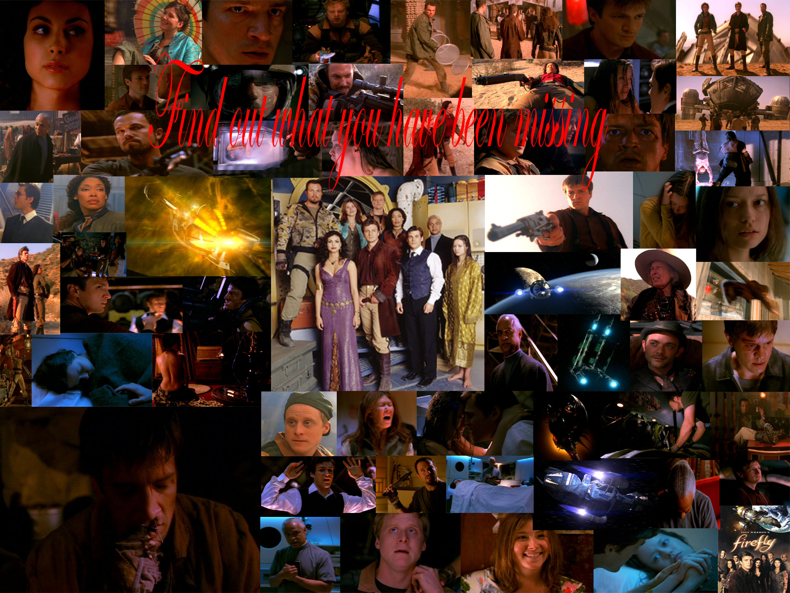
Working Collage
Thursday, March 4, 2004
This is only a footnote of what I plan to do and includes images from Serenity and a few from Train Job. This also is 1600x1200 so it could make a good wallpaper but I will be expanding on this is the future.
CATEGORY: GRAPHICS TIMES READ: 3446 RATING: 7.0 (G) SERIES: FIREFLY
Comments

Thursday, 04 March 2004 12:25
Very, very, very, very, very (etc. till it fills up a page) cool. Keep working on it.
ANONYMOUS
Thursday, 04 March 2004 12:32
Nice, some of them are a little distorted as-is but I very much look forward to the final. Im also to lazy to sign in today.
-Dracos
-Dracos

Thursday, 04 March 2004 16:24
(i'm a designer, so ignore this if you want to just take it easy ;P )
it looks good, and i'd love to see the final product. but, as dracos says, watch out for any distorted images. just one can ruin the whole thing.
only one overlap really seems to be a problem, the one near the bottom where kaylee has a chunk taken out of her forehead. i don't know if you're going to (able to?) add some filters/effects to the images to blend them and break the boxes. by no means necessary, but it could help some of the overlappiness.
i'd suggest looking at some of the image placement... you have a few where the characters are looking off the screen on the sides. you could just switch sides with those and it may give keep it all better contained.
the text could use some width, as well. it's a good font, but it's also very tight. firefly isn't very restricted/condensed. you can probably find some good free script fonts on the net. something nice and open would compliment firefly best, i think.
deffinately looking good though! :D
it looks good, and i'd love to see the final product. but, as dracos says, watch out for any distorted images. just one can ruin the whole thing.
only one overlap really seems to be a problem, the one near the bottom where kaylee has a chunk taken out of her forehead. i don't know if you're going to (able to?) add some filters/effects to the images to blend them and break the boxes. by no means necessary, but it could help some of the overlappiness.
i'd suggest looking at some of the image placement... you have a few where the characters are looking off the screen on the sides. you could just switch sides with those and it may give keep it all better contained.
the text could use some width, as well. it's a good font, but it's also very tight. firefly isn't very restricted/condensed. you can probably find some good free script fonts on the net. something nice and open would compliment firefly best, i think.
deffinately looking good though! :D
NIGHTWISE
Thursday, 04 March 2004 21:52
Very nice.
Please keep your good work.
I'm a late-comer to Firefly, but thank my friends for bringing me to it.
You (all) exemplify good fans - people who support something because they love it, though they get nothing else in exchange.
Later,
Nightwise
Please keep your good work.
I'm a late-comer to Firefly, but thank my friends for bringing me to it.
You (all) exemplify good fans - people who support something because they love it, though they get nothing else in exchange.
Later,
Nightwise
KENTWAITE
Thursday, 04 March 2004 22:53
Ditto the earlier comments of DitB. A good start, but definately need to fix the image with Kaylee partially obscured.
(Yes I'm a big Kaylee fan; and a big Jayne fan; and a Wash fan and, well, you get the idea).
Looking forward to the finished product.
(Yes I'm a big Kaylee fan; and a big Jayne fan; and a Wash fan and, well, you get the idea).
Looking forward to the finished product.
Post Your Comments
You must log in to post comments.