

Blue Sun Room GRAPHICS - IMAGES

Shimmer
Sunday, April 3, 2005
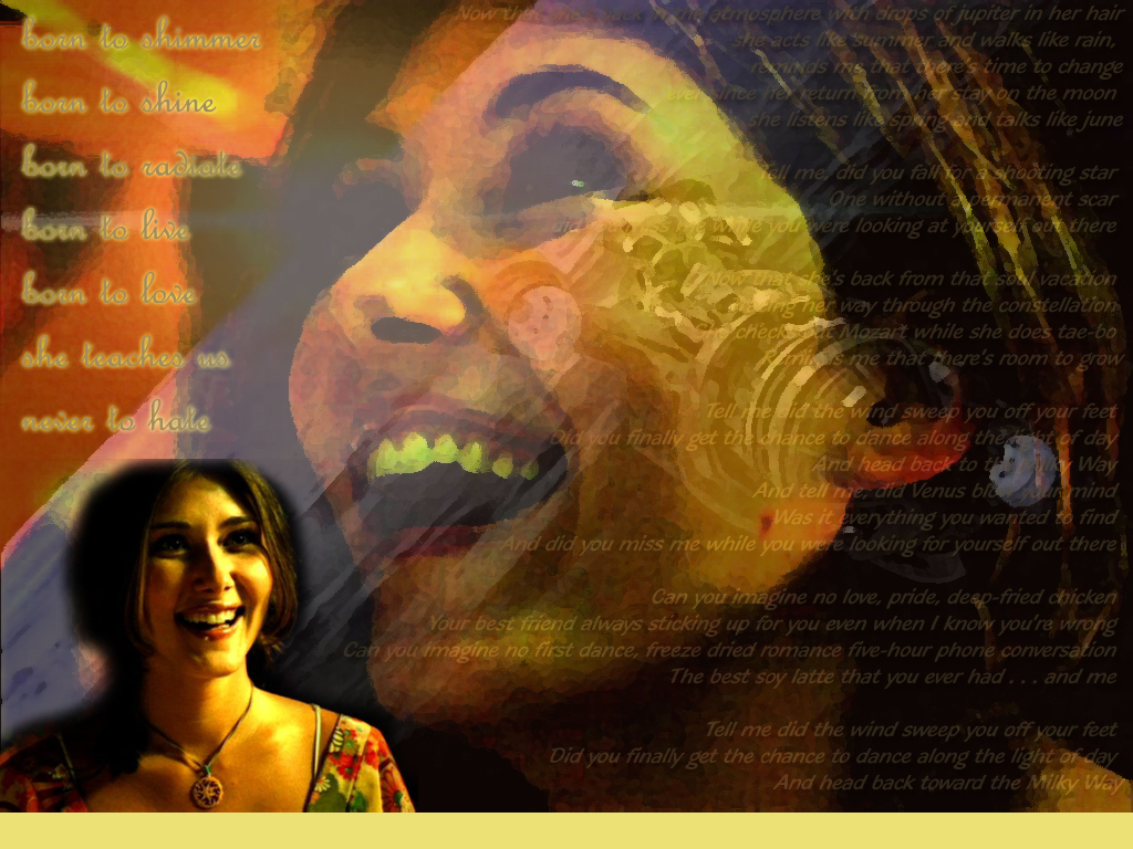
I wanted Kaylee brightness. I'm not sure what I did worked, but I think it's pretty ok. The large lyrics are from "Shimmer" and the smaller ones are "Drops of Jupiter". Would it look better without the small Kaylee shot on the left? Lemme know.
CATEGORY: GRAPHICS TIMES READ: 1289 RATING: 8.0 (G) SERIES: FIREFLY
Comments

Sunday, 03 April 2005 23:26
Overall it looks pretty good. I think the little picture is okay and you may want to have cropped it a little larger to keep from cutting off the top of her head.
I'm not sure about the Serenity layer though..do you think it warps her face and makes the lyrics too hard to read?
You're definitely learning Photoshop more quickly than I am :)
Mike
I'm not sure about the Serenity layer though..do you think it warps her face and makes the lyrics too hard to read?
You're definitely learning Photoshop more quickly than I am :)
Mike

Monday, 04 April 2005 00:34
I like the serenity layer. It makes me happy because you're all like "What's that!" and then you're like "it's serenity!" and people looking over you are like "you're weird!" ... it's all good!
But I am not sure I like the picture in the corner. Maybe either crop it differently (like lochravin said), get rid of it, or (my favorite) give it the same texture (the oil paint effect I think it's called) to it!
Otherwise, this is one shexney shexner! Rock on!
But I am not sure I like the picture in the corner. Maybe either crop it differently (like lochravin said), get rid of it, or (my favorite) give it the same texture (the oil paint effect I think it's called) to it!
Otherwise, this is one shexney shexner! Rock on!
Monday, 04 April 2005 02:39
i like the smaller pic in the corner but u might want to try to get a full head shot cuz its kinda cut off at the top.
Post Your Comments
You must log in to post comments.