

Blue Sun Room GRAPHICS - IMAGES
Prayer of St. Francis
Saturday, March 26, 2005
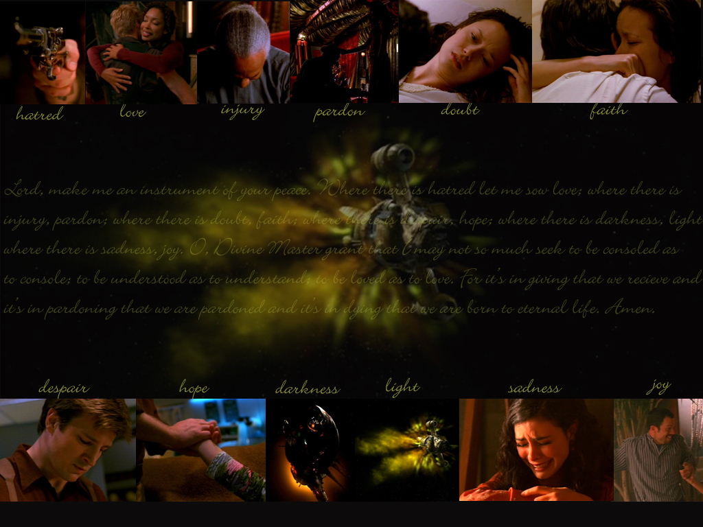
So I was watching BtVS and thinking how much I love Firefly and all of a sudden something came together as this beautiful song was playing. At the end of season 6 after Willow doesn't destroy the world, there's Sarah McLachlan singing the Prayer of St. Francis. Since I just learned how to make my way through Photoshop, I decided to give a wallpaper a spin. This is my first time... so be gentle.
CATEGORY: GRAPHICS TIMES READ: 1738 RATING: 8.0 (G) SERIES: FIREFLY
Comments
SPECIALHELL
Saturday, 26 March 2005 09:01
oh, and if anyone has any pointers for making wallpaper look as cool as everyone elses, let me know, eh?

Saturday, 26 March 2005 10:00
very nice, I don`t think I would have used the same image for the ship in the `light` image but otherwise it`s good
Zol.
Zol.

Saturday, 26 March 2005 17:26
Nice!!
To make it even better, I'd change one of the picture of Serenity, either the big one or the 'light' one. I also think the small pictures shouldn't be of so many various width. Maybe choose 2 different width (one large and one narrower). That's just my 2 cents :)
To make it even better, I'd change one of the picture of Serenity, either the big one or the 'light' one. I also think the small pictures shouldn't be of so many various width. Maybe choose 2 different width (one large and one narrower). That's just my 2 cents :)

Saturday, 26 March 2005 20:44
wow that is a very nice wallpaper but yeah i would of chosen a diffrent picture for the light one but other then that it looks great

Sunday, 27 March 2005 01:03
i liked it. it was very sweet, and i too love that song.
no power in the verse
xoxox-fredikayllow-xoxox
no power in the verse
xoxox-fredikayllow-xoxox
Sunday, 27 March 2005 15:30
Special,
I really liked this one too. How did you get the fade for your big paragraph? Did you change the opacity of the text or fade the entire layer once you embedded the text?
Mike
I really liked this one too. How did you get the fade for your big paragraph? Did you change the opacity of the text or fade the entire layer once you embedded the text?
Mike
ANONYMOUS
Sunday, 27 March 2005 15:50
I think I did a bit of both. I had already made the layer a bit transparent and then when I added the words I played around with opacity and fill until they looked good... there's really no method to my maddness.
Post Your Comments
You must log in to post comments.