

Blue Sun Room GRAPHICS - IMAGES
Browncoats autographs
Wednesday, March 23, 2005
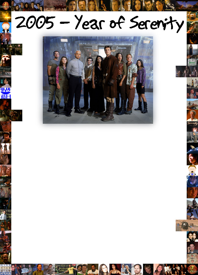
Here is the work in progress. Suggestions, ideas? The blank space is for the autographs. I don’t really like the pictures sticking out on both sides, and I still need to place pictures from other episodes (and maybe from wizard world) in there.
CATEGORY: GRAPHICS TIMES READ: 2821 RATING: 8.0 (G) SERIES: FIREFLY
Comments

Wednesday, 23 March 2005 12:45
I've put it in a low quality here, but that's just cause it's not the final version.
I'm thinking of printing it in a 40*60cm size (approx)
I also want to add a catch line that says what it is. Here’s what I came up with, it’s not very good IMO:
To our BDH, from
OR Browncoats from all over the place
OR Browncoats around the verse
I'm thinking of printing it in a 40*60cm size (approx)
I also want to add a catch line that says what it is. Here’s what I came up with, it’s not very good IMO:
To our BDH, from
OR Browncoats from all over the place
OR Browncoats around the verse
ANONYMOUS
Wednesday, 23 March 2005 15:07
I don't like the dots in the middle of the zeros in 2005...Also, maybe should try to incorporate the chinese character for Serenity in there somewhere? I don't mind so much the pictures sticking in from the sides, but I think the crew portraits on the top would look better if they were centered.
Matt
Matt

Wednesday, 23 March 2005 18:31
I agree. Lose the dots in the center of the 0s in 2005 & work the Chinese characters in. The pics hanging into the white field from the sides is a bit distracting. I do like the selection of pics though. Nice assortment, including the Firefly Park Jayne character.
Keep us updated as this is really cool and would be great to have copies for myself if possible to take to Dragon Con in Atlanta in September to get the cast to sign.
Keep us updated as this is really cool and would be great to have copies for myself if possible to take to Dragon Con in Atlanta in September to get the cast to sign.

Wednesday, 23 March 2005 19:28
I agree with the dots, I mean why the dots if not a smile underneath them. And that would just be too cutesy, so forget I said that.
Dut where the pics hanging in the white field are concerned, another design option is to space them out evenly. That way it looks like you meant to do that.
Dut where the pics hanging in the white field are concerned, another design option is to space them out evenly. That way it looks like you meant to do that.

Wednesday, 23 March 2005 22:39
Personally, I like the dots, but it's your choice. Can you take the photots sticking out and put them on the bottom or top row? Maybe you could put the round Serenity logo in the bottom corner or overlapping the corner of the big picture in the middle..
I love this idea btw - nice and easy to frame.. I might just have to bring it to Wizard World Philly if I go..
I love this idea btw - nice and easy to frame.. I might just have to bring it to Wizard World Philly if I go..

Thursday, 24 March 2005 02:09
Regarding the pics that look like they're sticking into the field: how about kiltering them a little, as if they are loose photos lying atop the field? Try putting small borders around them to try out the look - it may not work, but playfulness can lead to new destinations.
VANOLDEN
Thursday, 24 March 2005 02:24
lol, now that the dots have been mentioned, I think they make the zeroes look like boobs. *blush*
Great idea! I love your autograph FOR the stars concept! :)
Great idea! I love your autograph FOR the stars concept! :)
Thursday, 24 March 2005 08:31
*L* Vanolden... Now i just have to take them out!
Thanks for the advice all. You can send your autographs at flanatic_flo@yahoo.co.uk
Thanks for the advice all. You can send your autographs at flanatic_flo@yahoo.co.uk
ANONYMOUS
Friday, 25 March 2005 17:51
I think it looks cool Flo, and it'd a great idea!
Doubleshiny
Doubleshiny
ANONYMOUS
Saturday, 26 March 2005 04:38
Those long pics look kind of out of place. Either crop em or stagger em evenly. Other than that, nice work.
Now if I could only get this damn camera to work...
Tim
Now if I could only get this damn camera to work...
Tim
Post Your Comments
You must log in to post comments.