

Blue Sun Room GRAPHICS - IMAGES

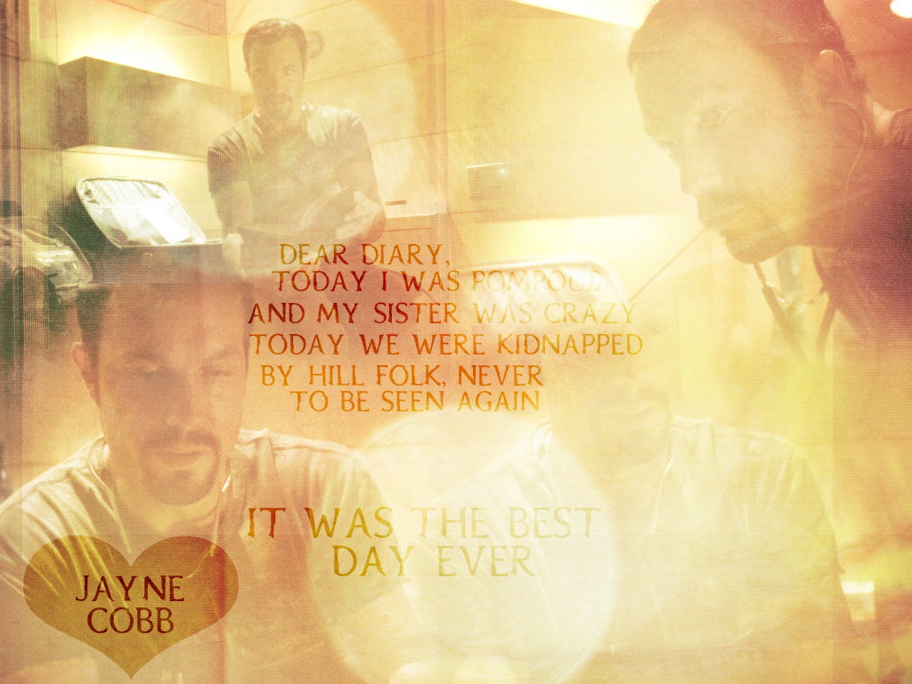
Jayne wallpaper
Thursday, March 10, 2005
I made it for the Firefly fixation (I'm the owner -- go there!: http://such-a-fangirl.org/totheblack). So, yeah.. it's Jayne in "Safe". 'Cause who doesn't like Jayne?
CATEGORY: GRAPHICS TIMES READ: 1722 RATING: 9.0 (G) SERIES: FIREFLY
Comments

Thursday, 10 March 2005 17:24
That's great. I really love it. You did an excellent job blending it all together and it represents Jayne perfectly. ;o)
SEREFINA9893
Friday, 11 March 2005 01:47
Shiny, but you kinda lose the 'pompous' in the brighter spot glare. Other than that, it's great. I especially like the heart.

Friday, 11 March 2005 16:59
Nice! Only it seems a bit too glarey for my likes. Jayne's image is too washed out.
ANONYMOUS
Saturday, 19 March 2005 23:47
Yeah, I know, I wish I'd made it darker, and I hated how the "pompous" was messed up.
(Oh, yeah, this is Erica - just too lazy to sign in xP)
(Oh, yeah, this is Erica - just too lazy to sign in xP)
Post Your Comments
You must log in to post comments.