

Blue Sun Room GRAPHICS - IMAGES
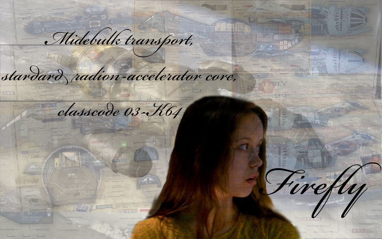
River blueprints try 2
Saturday, November 29, 2008
This is a modified version of River blueprints made after talking to my family. Better or worse than the first one? Comments wanted.
CATEGORY: GRAPHICS TIMES READ: 3718 RATING: 9.0 (G) SERIES: FIREFLY
Comments

Saturday, 29 November 2008 23:08
It's pretty shiny actually, but since you asked, a couple of quick suggestions. I wouldn't have any transparency in River. It's a tad distracting.
What I think would really make it pop though is to use the logo from the title sequence that has the halo effect (or whatever you want to call it) instead of the text. It would add a bit more color.
Overall though, great work.
What I think would really make it pop though is to use the logo from the title sequence that has the halo effect (or whatever you want to call it) instead of the text. It would add a bit more color.
Overall though, great work.

Saturday, 29 November 2008 23:13
I like “Try 1” better than “Try 2” because the cross-section of the Firefly comes through more clearly. Perfection would be if River's head was NOT partially transparent - it is distracting to have the schematic lines showing through her face. How about a “Try 3”?
But this "Try 2" doesn't have the lines showing as strongly through River's skin as “Try 1” so it is good, too, in its own way. It all depends on which is more interesting to the viewer, either River or Serenity.
But this "Try 2" doesn't have the lines showing as strongly through River's skin as “Try 1” so it is good, too, in its own way. It all depends on which is more interesting to the viewer, either River or Serenity.

Sunday, 30 November 2008 05:26
Thank you all. I'm working on making a new one now. I may even make two, one with the light background (like on this one) and one with the dark background(try one).
micjwelch, well I liked your suggestions I may not be able to add in the logo instead of text simply because it would be far too distracting. I will try and do something similar.
Once again, thank you eveyone one. I will try and get the new one(s) posted as soon as possible but I need to get to sleep soon so I will work on making them tomorrow. Don't know when they will get done.
Shiny dreams.
micjwelch, well I liked your suggestions I may not be able to add in the logo instead of text simply because it would be far too distracting. I will try and do something similar.
Once again, thank you eveyone one. I will try and get the new one(s) posted as soon as possible but I need to get to sleep soon so I will work on making them tomorrow. Don't know when they will get done.
Shiny dreams.
Sunday, 30 November 2008 05:27
Thank you all. I'm working on making a new one now. I may even make two, one with the light background (like on this one) and one with the dark background(try one).
micjwelch, while I liked your suggestions I may not be able to add in the logo instead of text simply because it would be far too distracting. I will try and do something similar.
Once again, thank you everyone. I will try and get the new one(s) posted as soon as possible but I need to get to sleep soon so I will work on making them tomorrow. Don't know when they will get done.
Shiny dreams.
micjwelch, while I liked your suggestions I may not be able to add in the logo instead of text simply because it would be far too distracting. I will try and do something similar.
Once again, thank you everyone. I will try and get the new one(s) posted as soon as possible but I need to get to sleep soon so I will work on making them tomorrow. Don't know when they will get done.
Shiny dreams.
Sunday, 30 November 2008 05:30
Sorry about the double post. The delete button isn't working so I can't fix it.

Sunday, 30 November 2008 05:41
re: the issue of transparency.
I thought about that in regard to #1, pro and con. Not sure if I like it or not. I do think it reinforces the notion of an identity between River and the ship. If that was the objective, , 's good...
I thought about that in regard to #1, pro and con. Not sure if I like it or not. I do think it reinforces the notion of an identity between River and the ship. If that was the objective, , 's good...

Monday, 01 December 2008 00:23
POSSIBLY THE SHINIEST BLUEPRINT IN THE VERSE.
I don't do all caps often, but it was deserved here.
And this version is much improved in clarity.
See NewOldBrownCoat's comment.
I don't do all caps often, but it was deserved here.
And this version is much improved in clarity.
See NewOldBrownCoat's comment.
Post Your Comments
You must log in to post comments.