

Blue Sun Room GRAPHICS - IMAGES
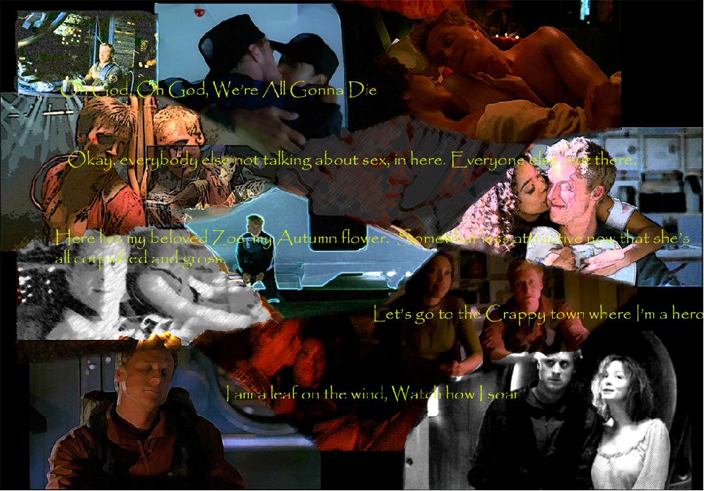
Wash Collage
Wednesday, January 17, 2007
Pretty much the same as the River one except I experimented with the media.
CATEGORY: GRAPHICS TIMES READ: 2406 RATING: 7.0 (G) SERIES: FIREFLY
Comments

Wednesday, 17 January 2007 10:32
I like how this turned out, except the coloured pencil one. That came out too grey. My favourite one is Mal and Wash being tortured.
Wednesday, 17 January 2007 12:29
kinda can't read the font. If you're using photoshop add a "stroke" 1px (black would be best) for the text layers. It's in blending options.

Thursday, 18 January 2007 01:25
I'm with fei: the font is a mite illegible. Probably cause (guessing): you resized the jpg to make it smaller for upload? Fonts are the first to show visible distortions that way. Resize first, then apply font.
Also, it's important to get the quotes right. Browncoats notice these things. :) Like:
"Okay. Everybody NOT talking about sex, in here. Everybody else, elsewhere."
And:
"We gotta go to the crappy town where I'm a hero."
Also, it's important to get the quotes right. Browncoats notice these things. :) Like:
"Okay. Everybody NOT talking about sex, in here. Everybody else, elsewhere."
And:
"We gotta go to the crappy town where I'm a hero."

Thursday, 18 January 2007 04:45
It ain't perfect...but that's the way we like it;)
BEB
BEB
Post Your Comments
You must log in to post comments.