

Blue Sun Room GRAPHICS - IMAGES
Browncoat Hat - Help Please
Saturday, August 12, 2006
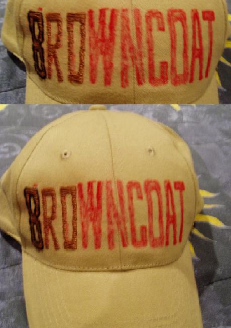
I'm working on embroidering my very own browncoat hat but I'm having a hard time deciding on the bordering so I'm looking for opinions. Should I outline all of the letters in black the way the B is, or should I maybe outline them in the same brown color to even out the lines when I'm done and leave it at that. Suggestions, criticisms, or encouragements welcome. Thanks All.
CATEGORY: GRAPHICS TIMES READ: 1809 RATING: 8.0 (G) SERIES: FIREFLY
Comments

Saturday, 12 August 2006 12:40
I think outlining in brown to keep the letter straightest is not a bad idea... the black seems to make it a bit too dark for me, just my opinion of course :o)
What an ambitious undertaking! Great idea! Be sure to show us the finished product!
What an ambitious undertaking! Great idea! Be sure to show us the finished product!

Saturday, 12 August 2006 14:58
I agree, the black is a little too dark.
Outlining in brown gives it a neat appearance without distracting from the message as a whole.
Outlining in brown gives it a neat appearance without distracting from the message as a whole.

Saturday, 12 August 2006 15:15
thanks guys that's kinda what I was worried about with the black. my mom had an idea this morning though, what about outlining in a slightly darker brown?

Sunday, 13 August 2006 04:24
Dark brown would suit the theme better, since we be "BROWNcoats";)
BEB
BEB

Sunday, 13 August 2006 08:11
Yeah, definately a darker brown. That would be really shiny. I agree that the black is a little too dark. Coolness on the the embroidering, though, I mean, they actually look like letters. Give me a hat and some brown thread, and I'd ben lucky if I came back with two fully functional thumbs. Keep it up!
Sunday, 13 August 2006 10:34
hehe yeah this is my first attempt at embroidering which is why the letters arent too precise or clean cut yet but I've gotten some good tips from grandma so that helped. :) The needle's not very sharp though so it kinda hurts working on it but I'm getting a letter or two done at a time right now before I have to stop and rest my hand so it should be done pretty soon. I'll be sure to post a picture of the finished one when its done.
Post Your Comments
You must log in to post comments.